Resources
Stockholm, Sweden
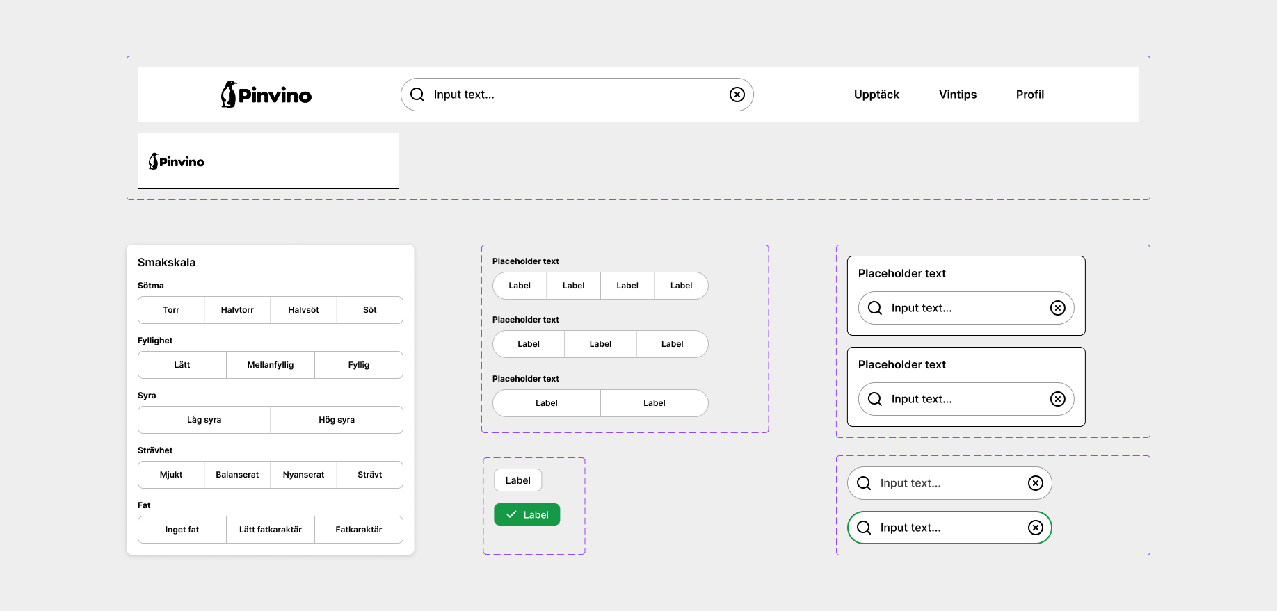
Choosing wine is often overwhelming. With endless options and little guidance, users struggle to make confident decisions, especially when trying something new. Pinvino was designed to simplify discovery by guiding users through taste, inspiration, and personal collections.
Year: 2024
Client: Pinvino
Role: UX/UI-designer
The Problem
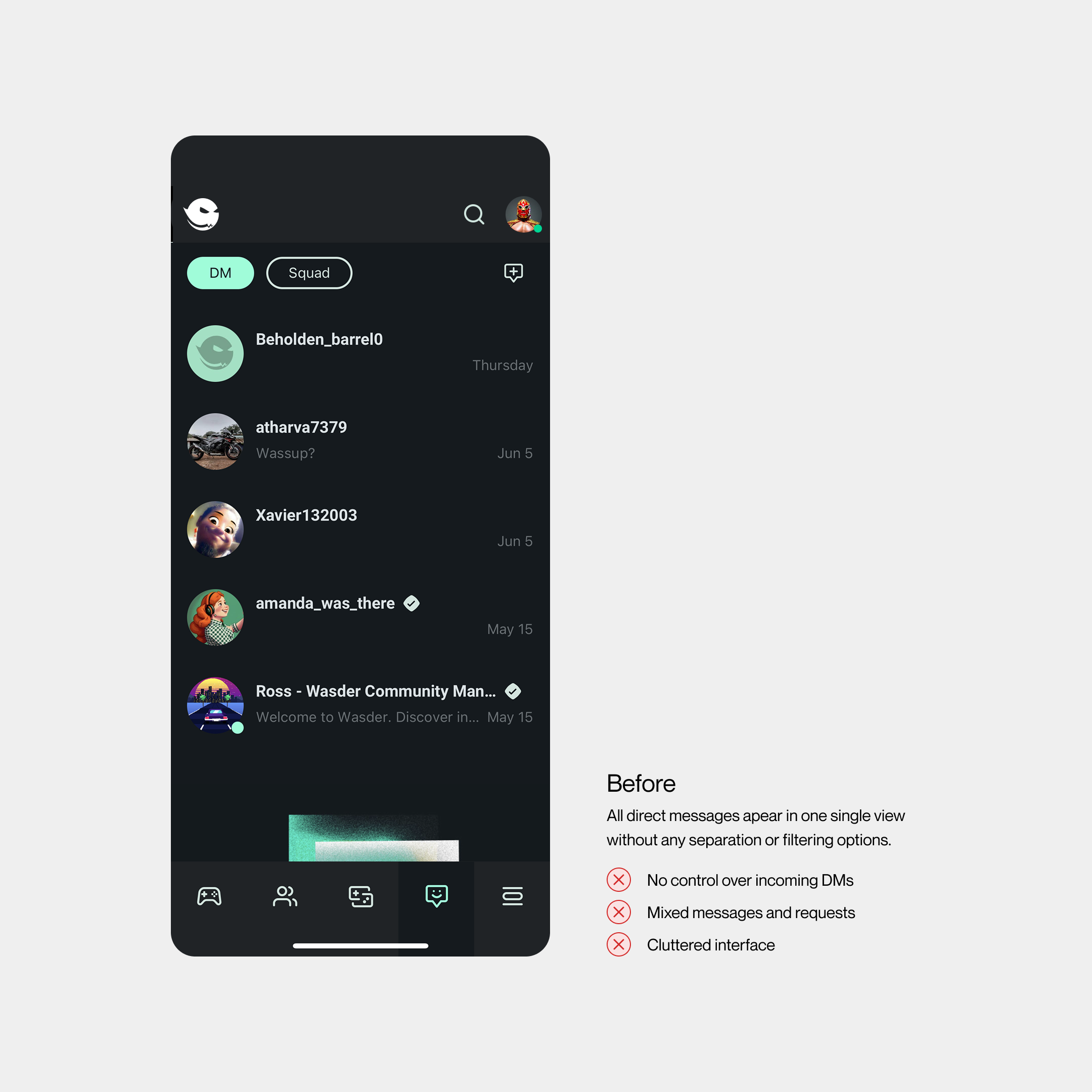
The issue wasn’t the existence of two connection types, but the absence of a clear mental model. Users didn’t understand who could message them, what different connection states meant, or what level of interaction was allowed. As a result, interactions felt uncertain, and many users chose not to engage at all.
Users
The target group was “Next Gen Players” (13–25), a generation where gaming is a natural part of everyday life. They expect clear patterns, familiar interactions, and fast feedback. When something feels unclear, they tend to disengage quickly.
Role & Team
I worked as a UX/UI Designer in a small cross-functional team of 15–20 people, collaborating closely with developers, product owners, and other designers. My work covered the full process from research to final design delivery.
Scope & Constraints
The work was structured in fast 2–3 week sprints. The connection system was already deeply embedded in the product, so changes needed to balance user needs with technical constraints.
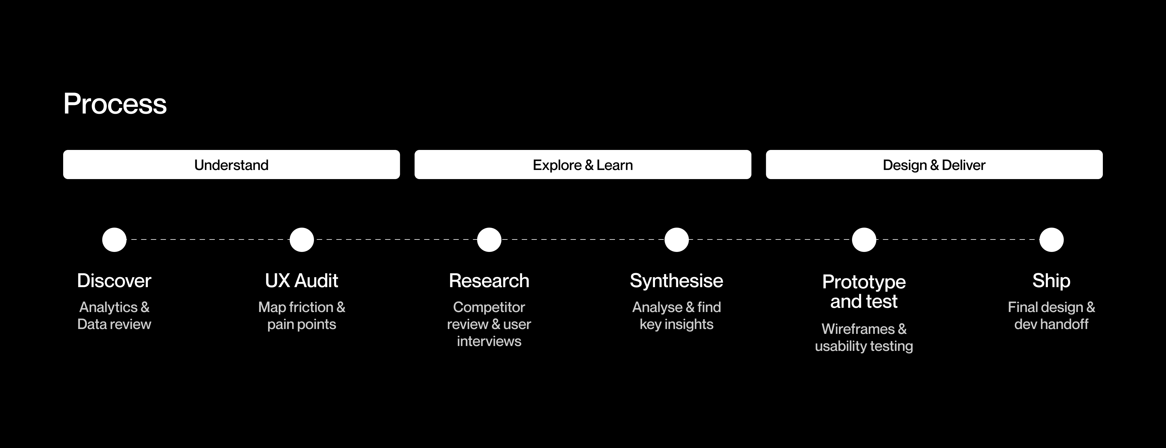
Discovery
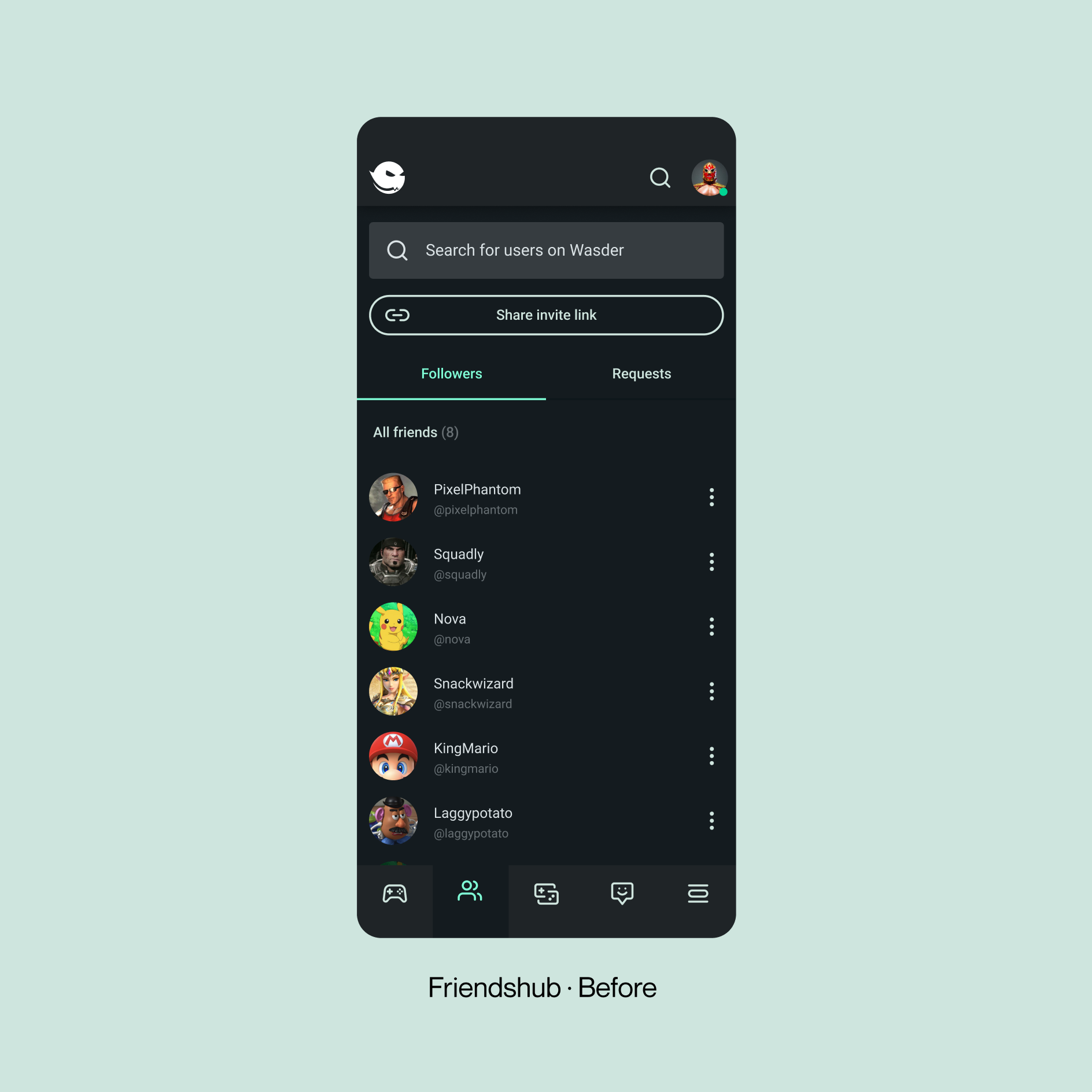
Existing data showed that users didn’t understand the difference between followers and friends, as both behaved similarly. Further analysis revealed a lack of control, especially around messaging, where both connection types could send DMs without any form of permission.
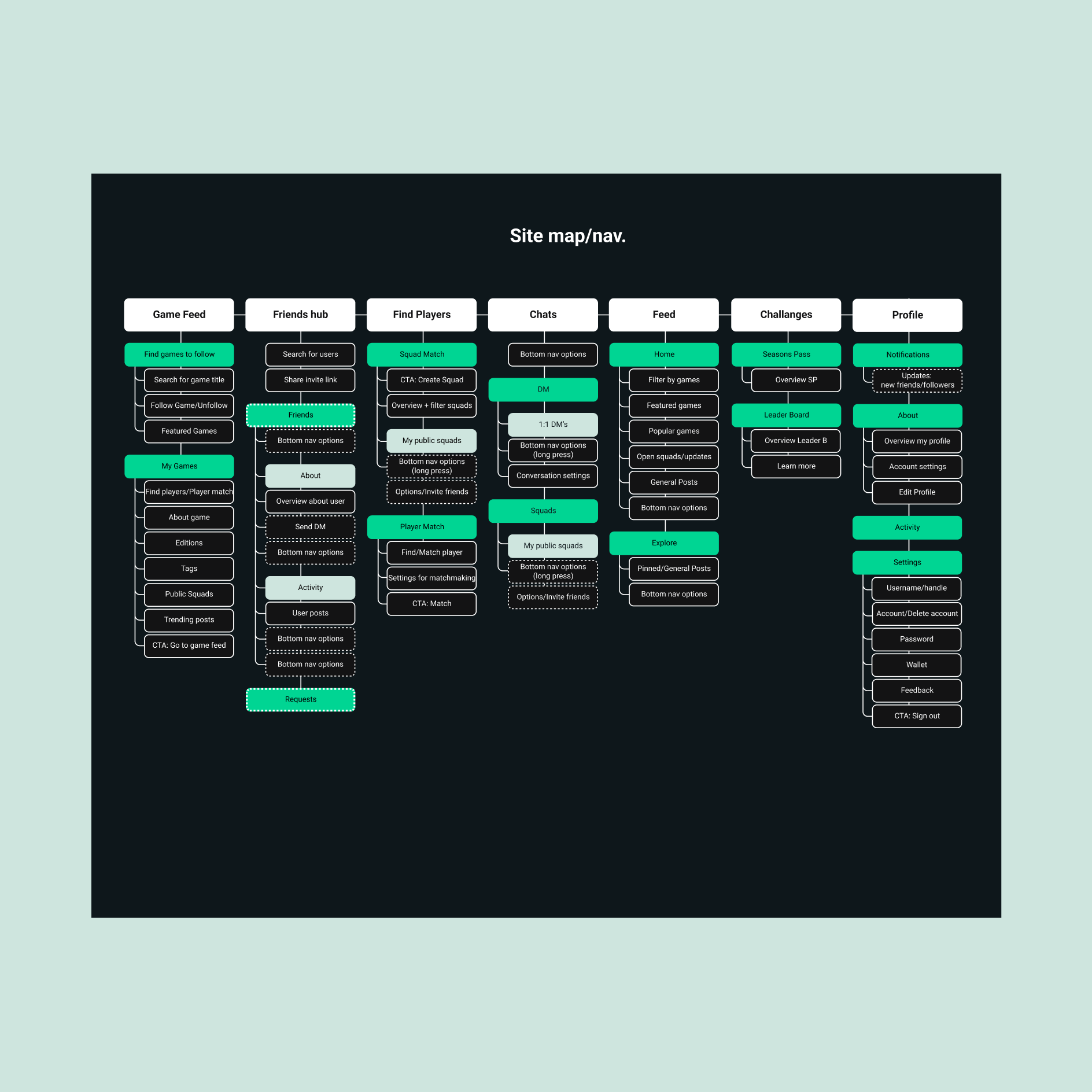
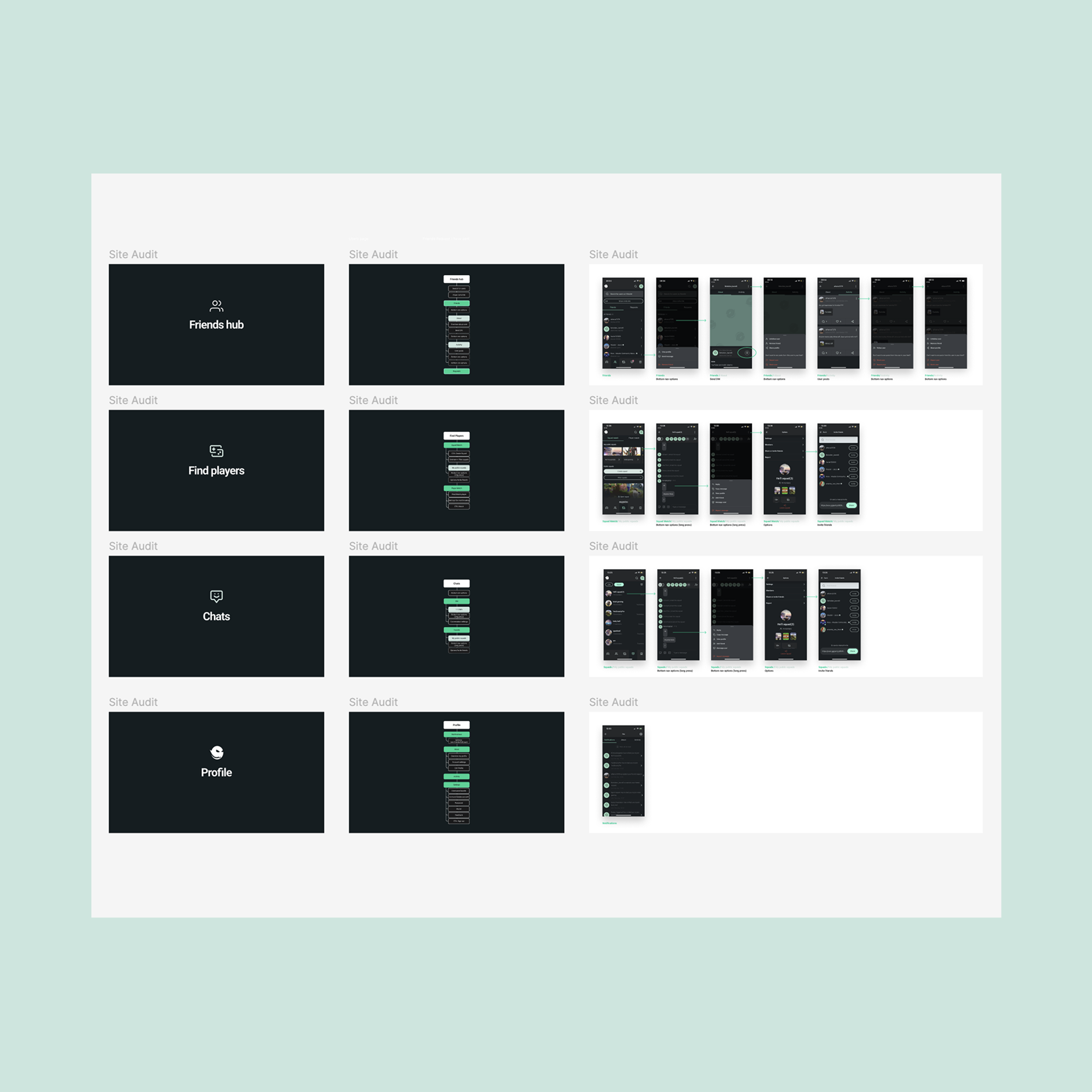
UX Audit & Research
Due to the tight timeline, I used a site audit to identify usability issues and form early hypotheses. I also created a site map to understand the connection system and analyzed other social platforms for established patterns and user expectations. These insights guided the design direction despite limited user testing.
Synthesise
The issue wasn’t having two connection types, but the lack of a clear mental model. Competitor analysis showed that most platforms with similar systems rely on familiar, well-defined patterns to avoid confusion. In Wasder, this was unclear, creating uncertainty around visibility, messaging, and control, and leading to hesitation in user interaction.
Prototype & test
I explored three directions:
1. Keep both followers and friends, but clarify the differences
2. Simplify to a “followers / following” system
3. Simplify to a “friends-only” system
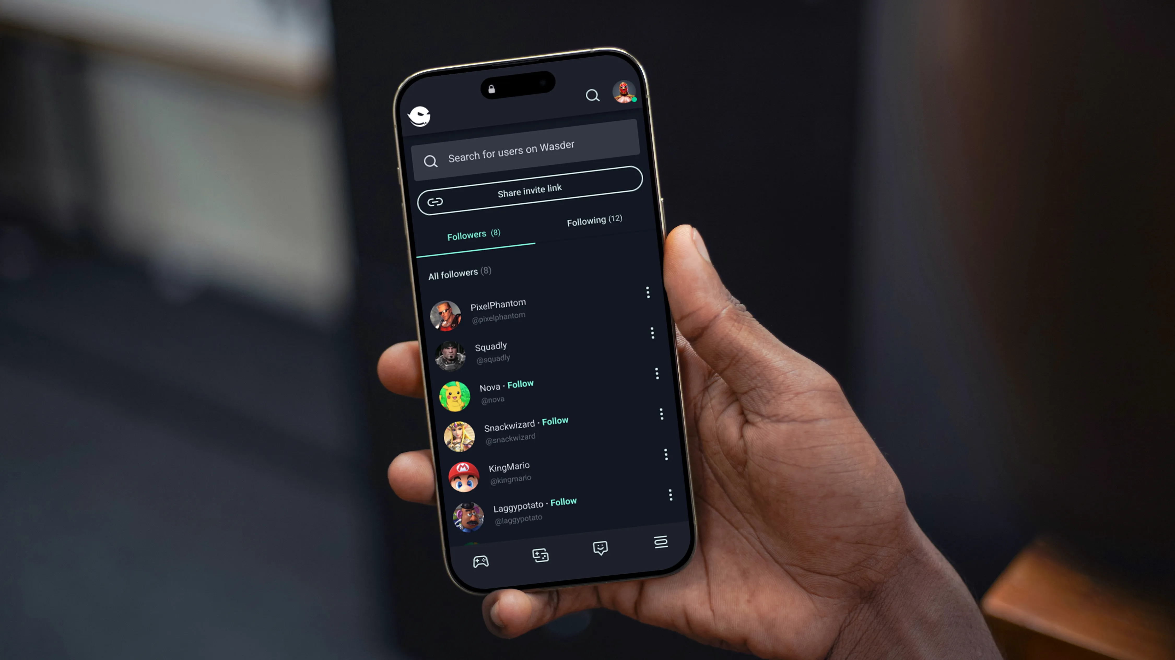
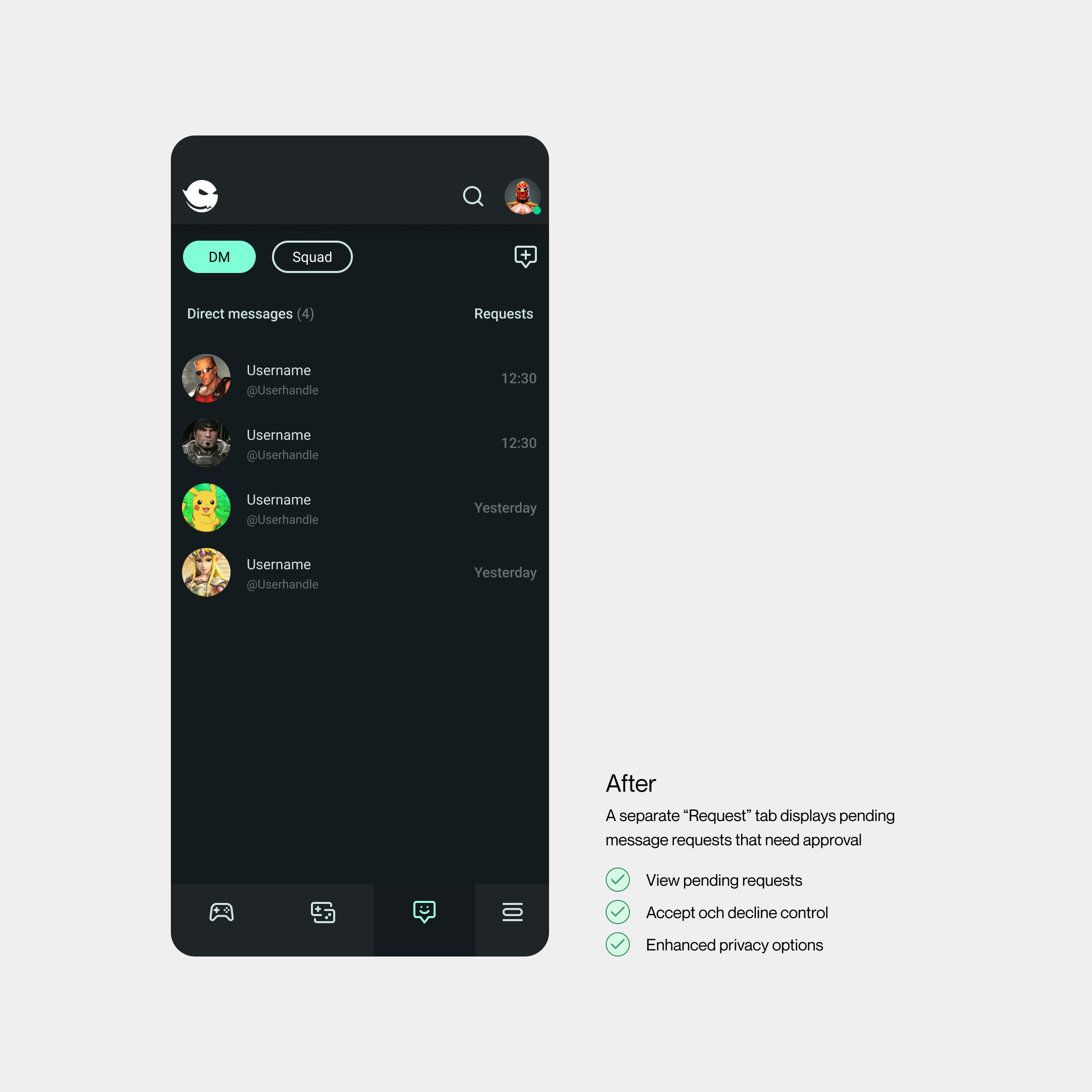
After alignment with product and development, we chose the followers / following model. The main change focused on Friendshub, which was redesigned to support the new structure and remove the “friends” concept entirely.
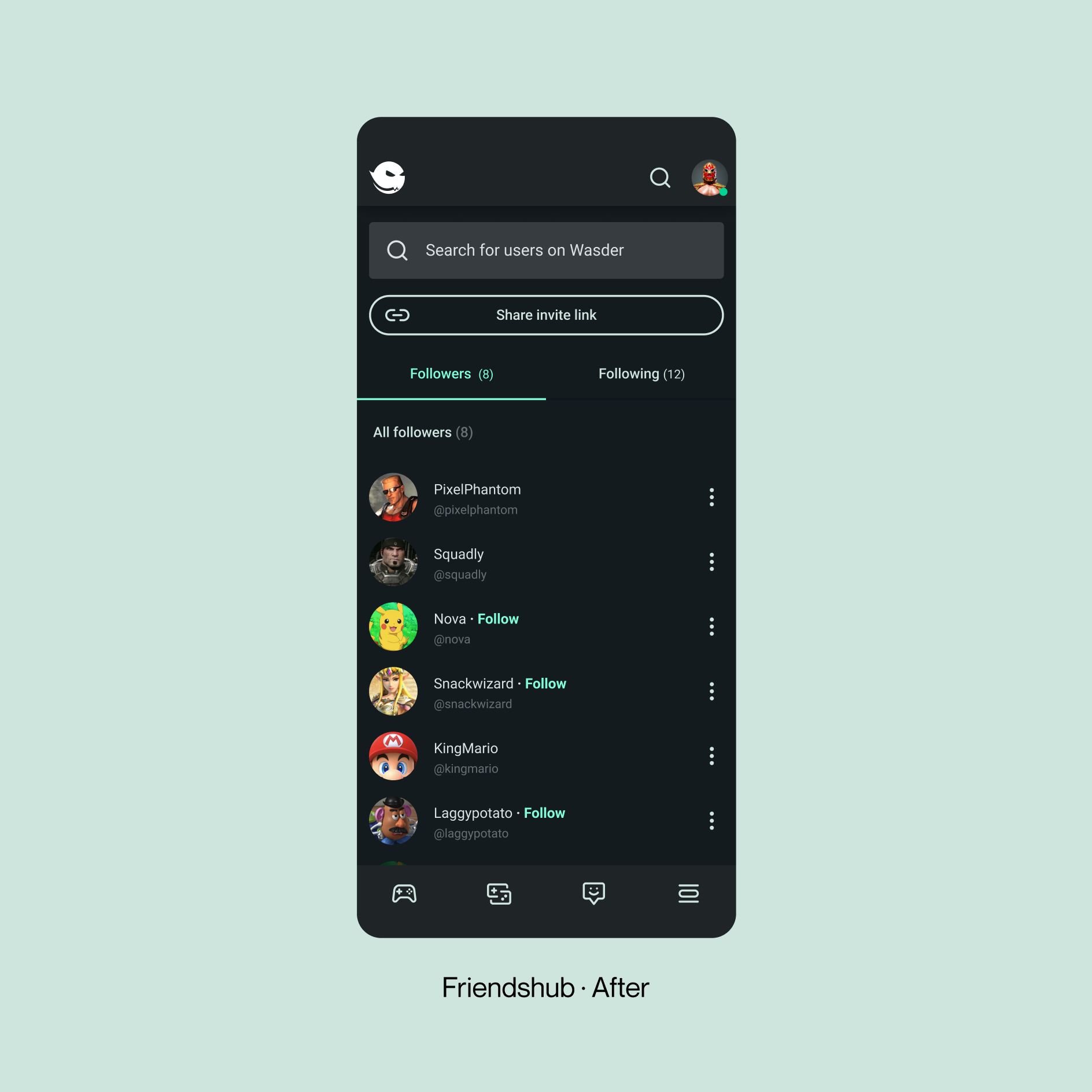
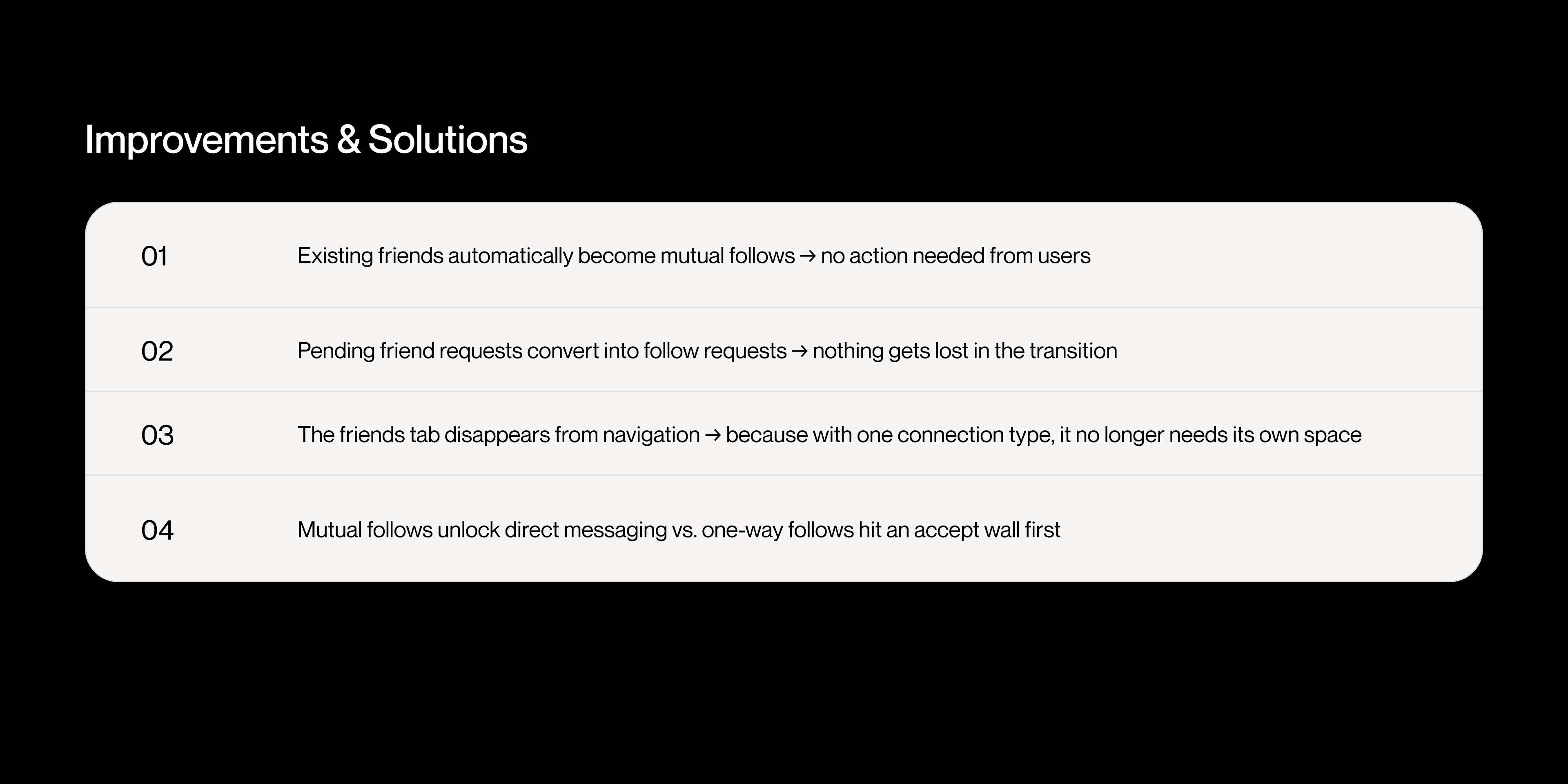
As the connection system was already integrated into the app, we worked closely with developers and product owners to define how the different connection states should behave. This resulted in four key rules that guided the redesign (Improvements & solutions).
Ship
The redesigned system reduced ambiguity and created a more predictable interaction model for users. It also helped define clarity and improve user control by a simple interaction model.
One-way follow → limited interaction
Mutual follow → full interaction
Pending follow → requires acceptance
Result
Due to time constraints, we weren’t able to test the redesign at a deeper level, which made it difficult to fully evaluate its impact.However, the tests we conducted showed clear signs of improvement, particularly in user understanding and clarity around interaction rules. The new structure also proved easier to build on, reinforcing that the direction was right even without full validation.